Design 1
Terraza
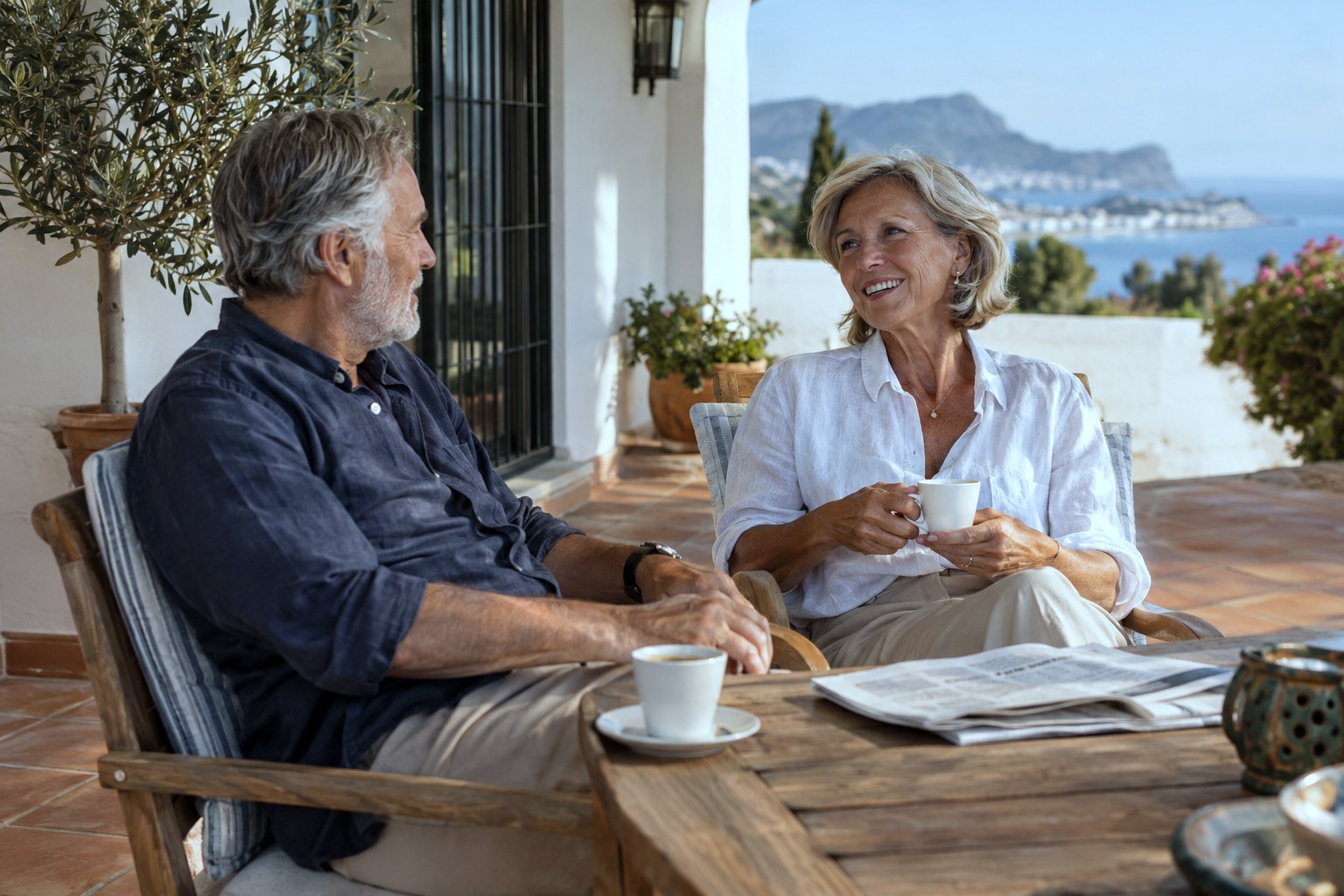
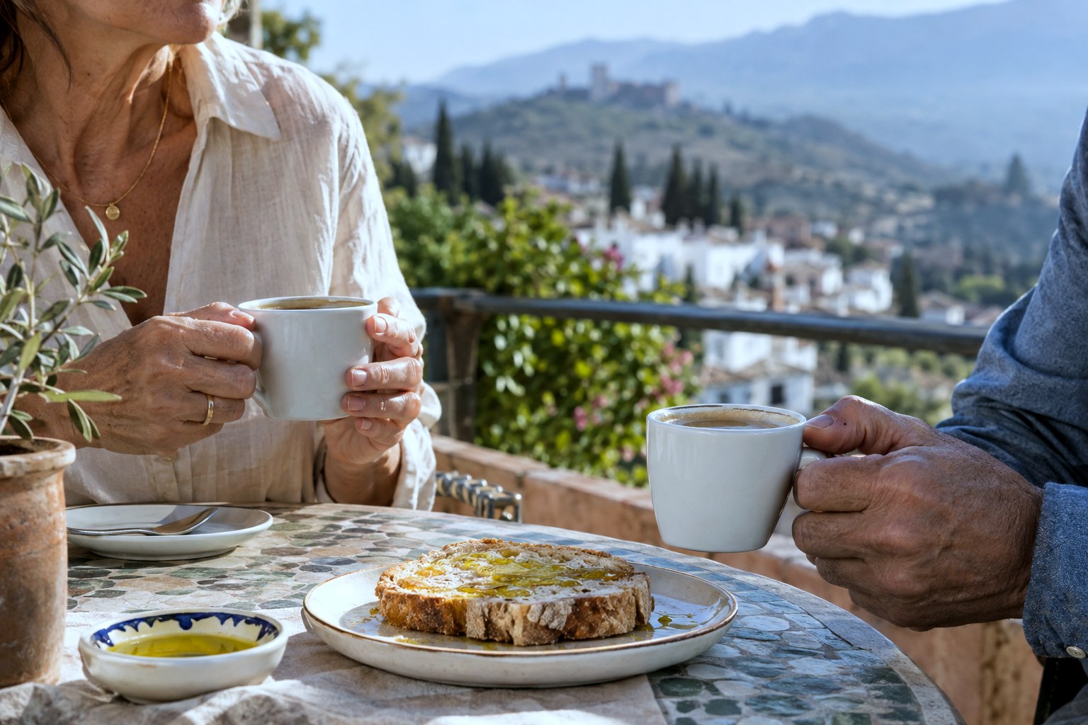
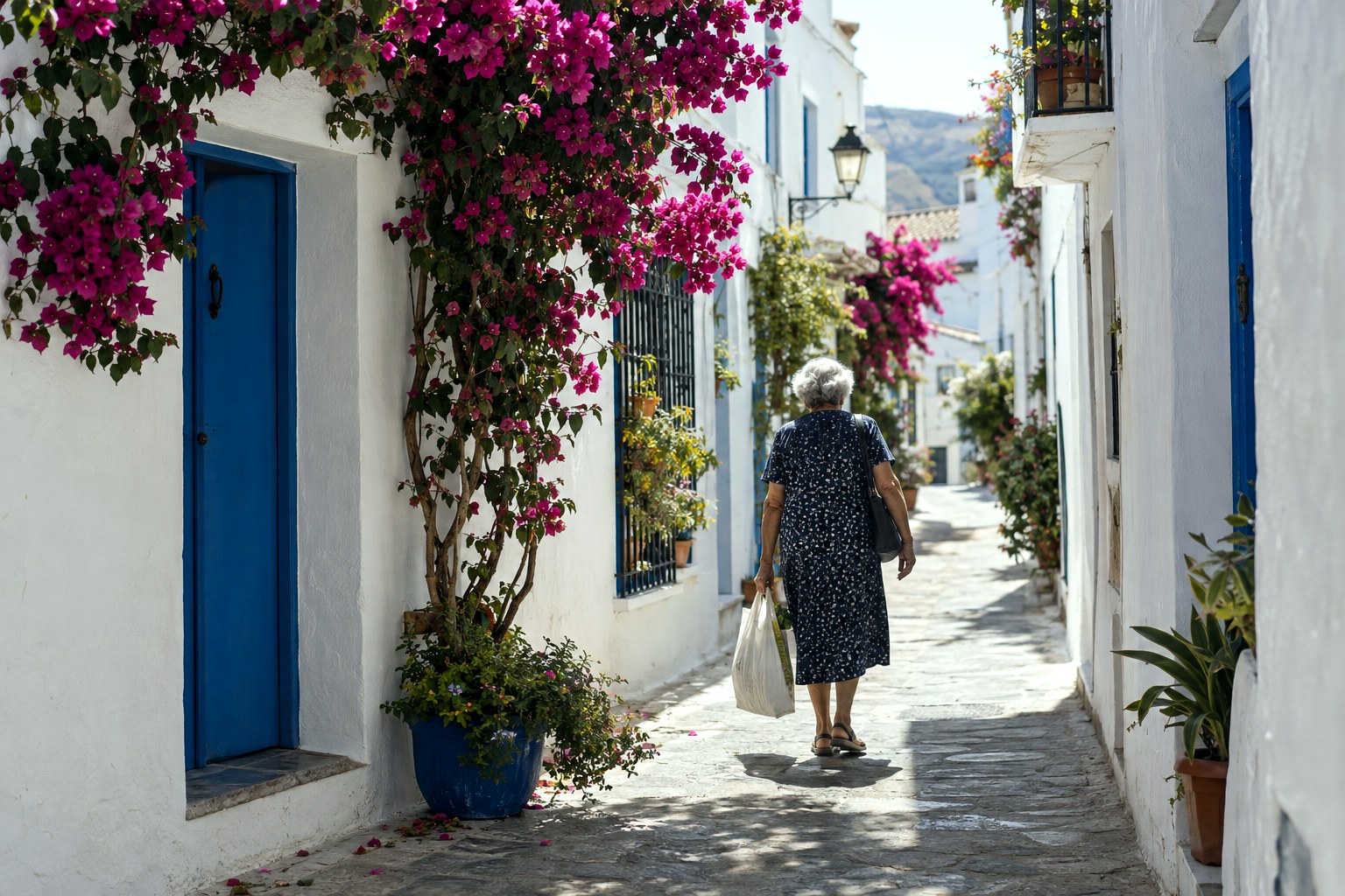
The thinking. Most financial sites feel like banks. This one feels like a conversation on a shaded terrace. Warm sand tones, a calm serif, and generous white space slow the page down, because the decision this audience is making shouldn't be rushed. Hand-drawn sun and olive motifs and a dotted journey path replace the usual corporate iconography with something human.
Best for a brand that wants to be approachable first and financial second.